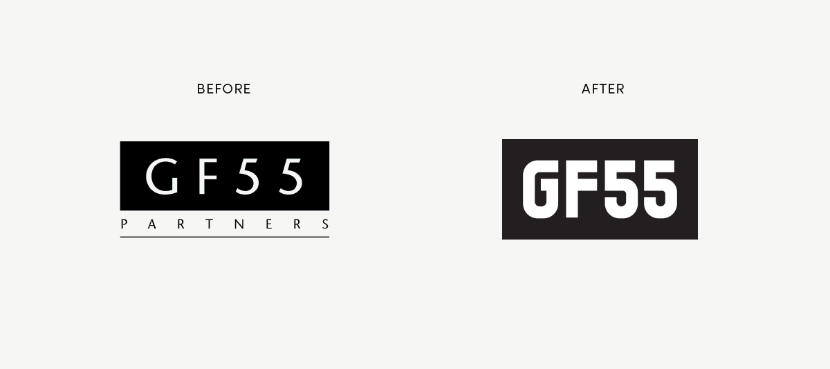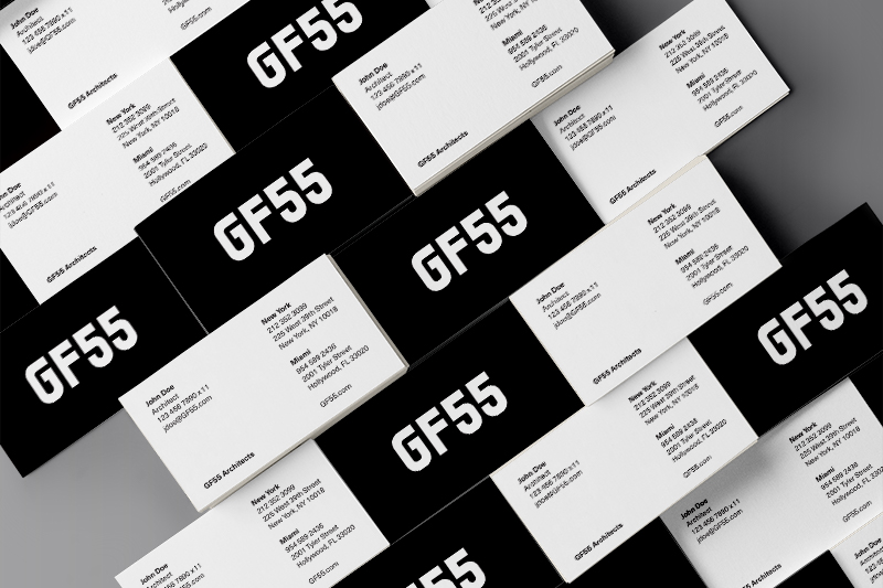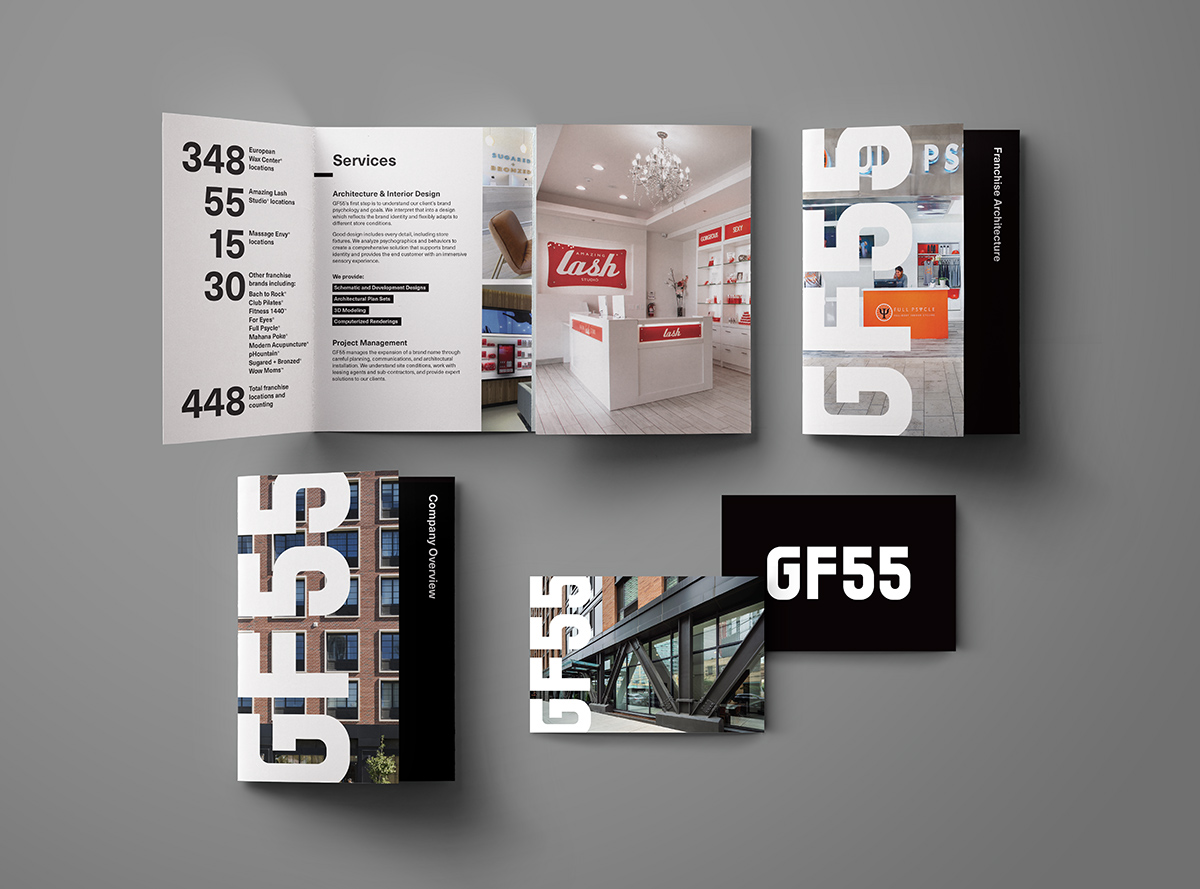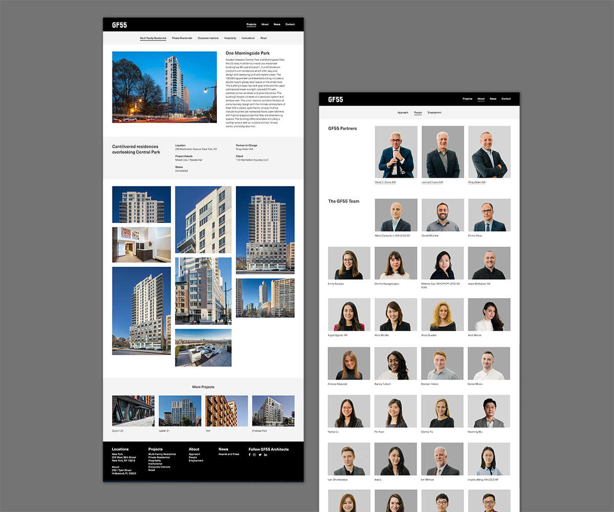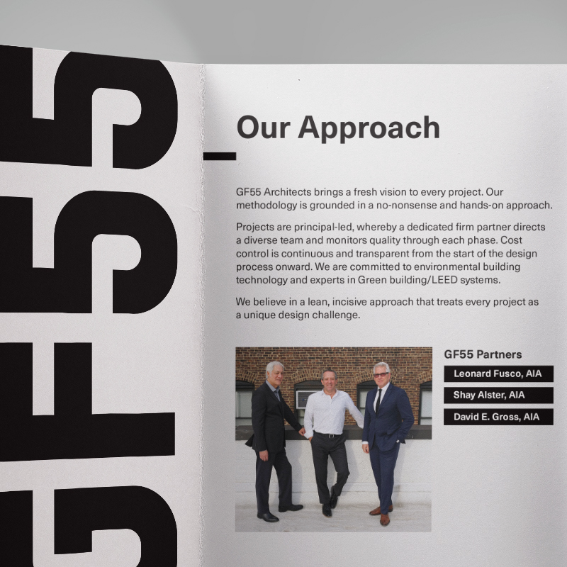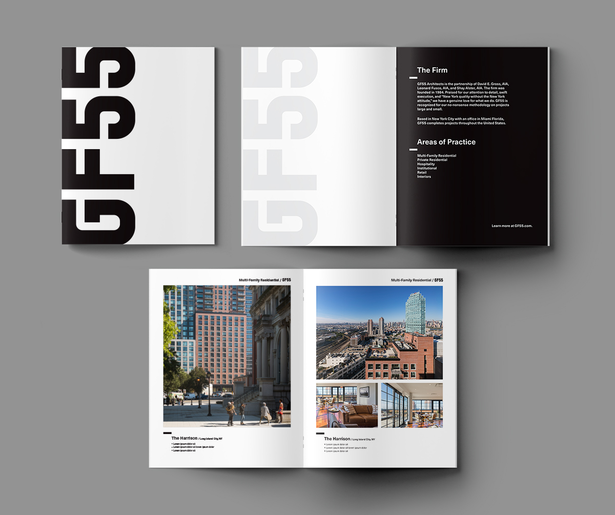
A new brand identity for GF55, a New York City architecture firm. The existing logo was redesigned and simplified to be stronger and bolder, with all-upright characters instead of leaning numbers. Simple black-and-white fields, punctuated with the distinctive GF55 lettering, are the backdrop for showing the firm’s projects. Headed by partners who love their city, GF55 takes a no-nonsense, hands-on approach to their projects. This pragmatic attitude is reflected in their new brand identity.
