
A project I completed recently was an update to The Joseph Sears School’s visual identity. Joseph Sears, located in Kenilworth, IL, has a long heritage of excellence but lacked a school logo for everyday use. The school seal, adopted in the 1920s, had been utilized for all school communications despite its formality and fine detail that made it difficult to reproduce and discern at small sizes. Electronic versions of the seal had become distorted and grainy.
We created a new school logo for common use that employs a traditional crest, Joseph Sears blue, and Kenilworth’s signature elm leaves. It conveys the prestige for which the school is known, yet it’s quicker to recognize at a glance and more distinctive than a seal—most round seals look pretty similar.
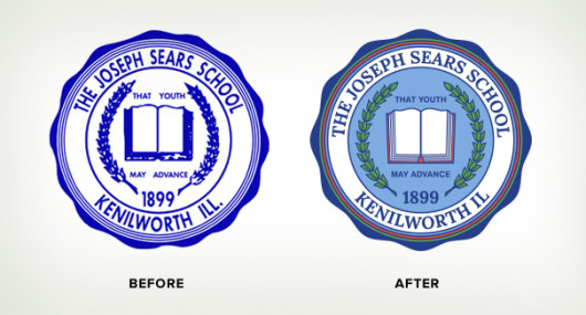
We cleaned up the antique seal and updated the typography to match the logo for a tighter identity. One-color and full-color versions are now available to the school for use exclusively on formal documents.

The school’s panther mascot was updated from a delicate line drawing to a more robust sports logo.

The new panther’s fierce, glowering stare inspires more confidence than the older thin sketch and completes a cohesive identity.
Check out more components of this branding project.

