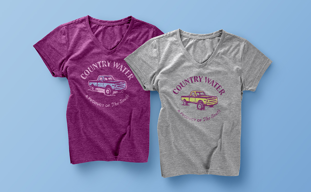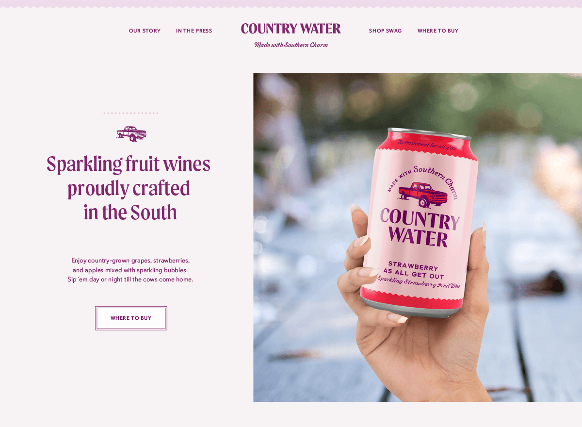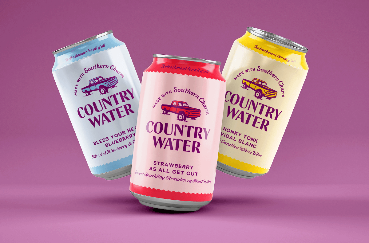
Country Water is a new canned wine brand based in North Carolina. Local pride is strong for southerners, and until now, there hasn’t been a canned wine brand to hitch their wagon to. These beverages are made with regionally-grown fruit, no artificial flavors, and a little bit of Southern charm. The cans are more portable than glass bottles, so folks can tote them to the beach or sip ’em on the porch.
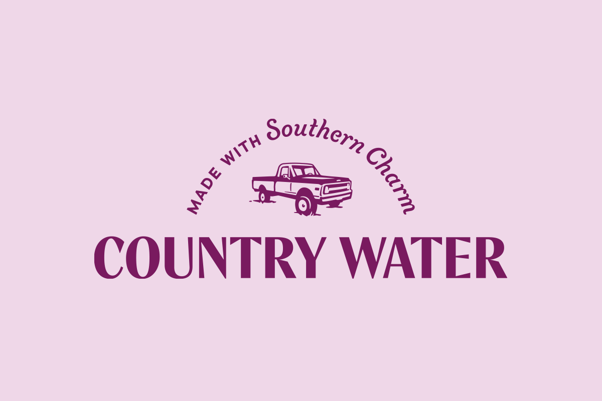
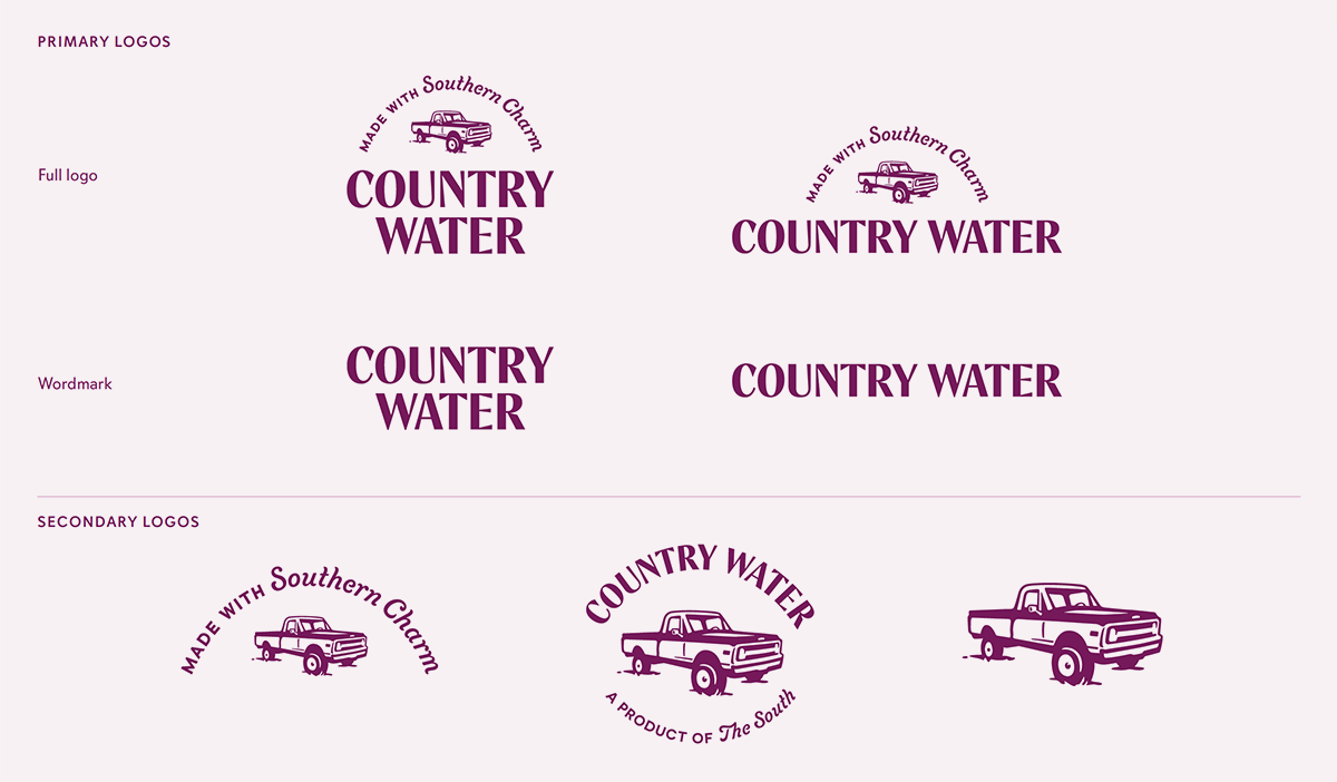
During the discovery part of this project, I asked founder Tana Cowin, “If this brand was a car, what type would it be?” She replied: “a baby blue 1969 lifted Chevy C10.” And that little comment became the inspiration for the logo. Nothing says “country” like a pickup truck, so that’s the Country Water brand emblem we designed.
The truck is paired with a polished wordmark. Sometimes a tagline arcs over top in a script typeface, chosen to embody some of that Southern charm.
Grape is the brand’s signature color. It’s deep enough to contrast with secondary hues that correspond to fruit flavors. (Carolina blue is included, naturally.)
As products were being developed, I proposed names and taglines that continue the southern-country theme.


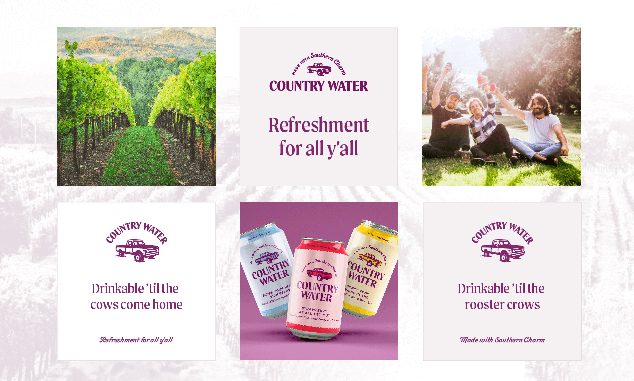
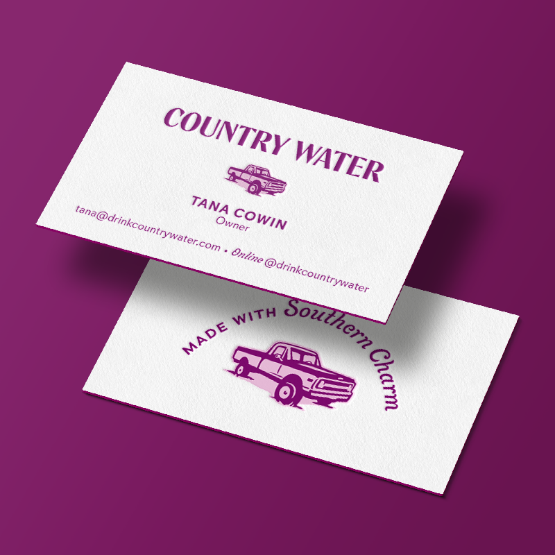

Everything shown is a mockup, made for testing designs and showing what could be. Before any wine gets canned or merch is made, we need to see how the brand would play out.
Making something tangible out of the gleam in an entrepreneur’s eye is my favorite thing. I can’t wait to see Country Water on a shelf in my local store!
