When people contact me about a branding project, they often have a scope in mind: a logo, fonts and colors, maybe a business card. It makes sense. Those are tangible deliverables that are easy to picture. Whether...Continue Reading
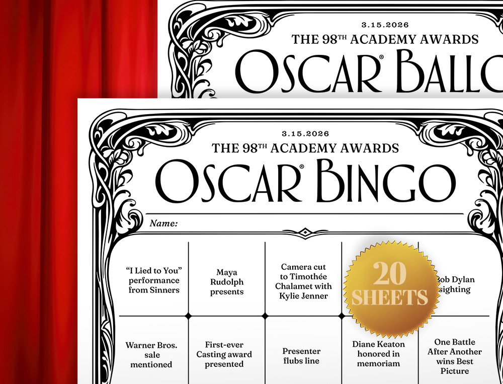
Congratulations! So far you’ve survived 2026, and the Academy Awards approach. If you like the Oscars, that means it’s time to download and print some Oscar party games before the show on Sunday, March 15. As always,...Continue Reading
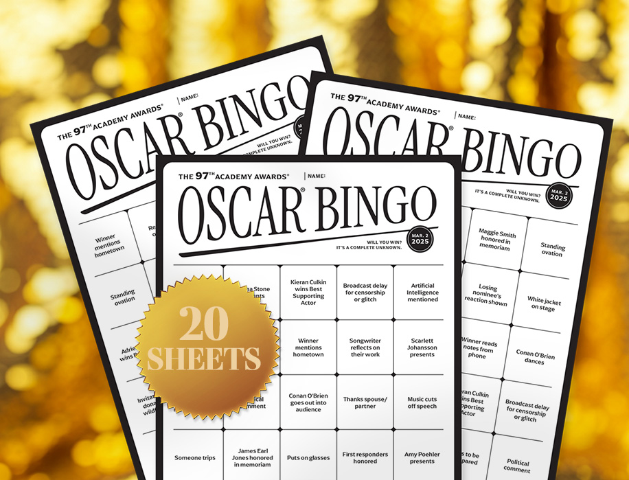
Time to download 2025 Oscar bingo cards for your Oscar party! Squares are customized for the 2025 nominees and presenters. This year the Academy Awards are Sunday, March 2 at 7 PM EST. This marks my...Continue Reading
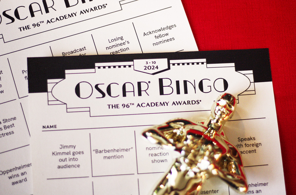
Oscar bingo game cards, 2024 edition, are ready for free downloading! Whether you’re headed out to an Oscar party or lounging on the couch in your mojo dojo casa house, I hope it makes your night...Continue Reading
Something I’ve been pondering in my business is how many choices to give clients. I ordered an açaí bowl at a café recently. I had no idea what toppings to add, because I didn’t even know what...Continue Reading
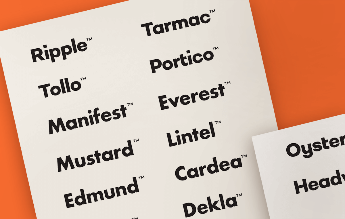
Sometimes you hear a business name that’s so good, it sticks with you. Years ago I stumbled on a small shop in Portland called Noun: A Person’s Place for Things. I don’t remember much about the pretty...Continue Reading
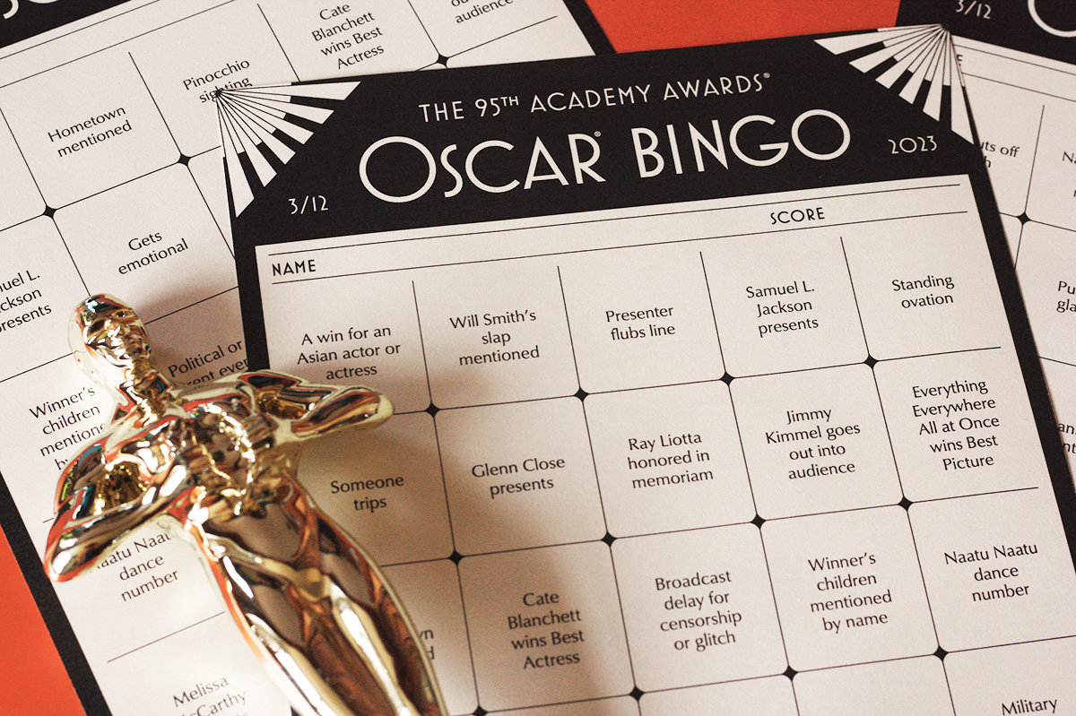
2023 Oscar bingo cards are ready! Grab your free PDF download below, ahead of the show on Sunday, March 12 at 8 PM ET. This year’s design (my 15th annual, holy cow) is art deco-inspired. I like...Continue Reading
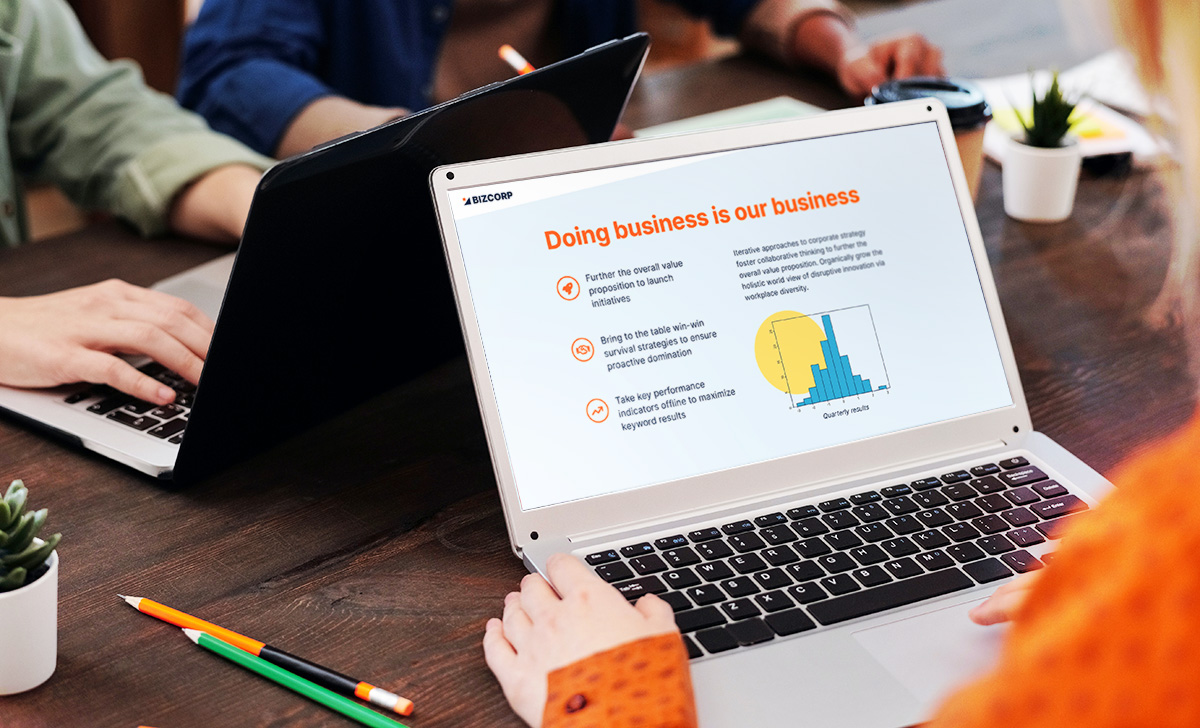
Greetings, office peeps! When you’re designing a Powerpoint presentation or Word document, do you ever feel like something doesn’t look right? You can’t put your finger on it. Somehow the page looks amateur instead of professional. If...Continue Reading
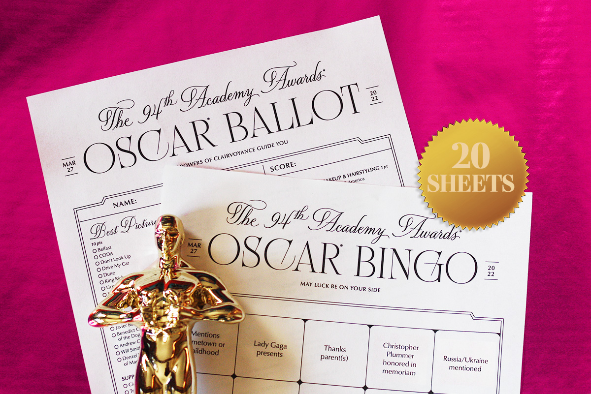
My Oscar bingo cards for 2022 are ready. This year the Oscars will be on Sunday, March 27, 2022 at 8 PM ET on ABC. It’s my 14th year in a row designing bingo cards. It’s tradition....Continue Reading
This website uses cookies. We'll assume you're ok with this, but you can opt-out if you wish. Cookie settingsGOT IT
Privacy & Cookies Policy
Privacy Overview
This website uses cookies to improve your experience while you navigate through the website. Out of these cookies, the cookies that are categorized as necessary are stored on your browser as they are essential for the working of basic functionalities of the website. We also use third-party cookies that help us analyze and understand how you use this website. These cookies will be stored in your browser only with your consent. You also have the option to opt-out of these cookies. But opting out of some of these cookies may have an effect on your browsing experience.
Necessary cookies are absolutely essential for the website to function properly. This category only includes cookies that ensures basic functionalities and security features of the website. These cookies do not store any personal information.
Any cookies that may not be particularly necessary for the website to function and is used specifically to collect user personal data via analytics, ads, other embedded contents are termed as non-necessary cookies. It is mandatory to procure user consent prior to running these cookies on your website.