Several people have asked about the weird-looking words used in one of my latest fabric prints. Other conversations have revealed that not everyone has heard of the famous quick brown fox. So let me demystify the names of the fabrics in my new Typography collection for Cloud9 Fabrics.
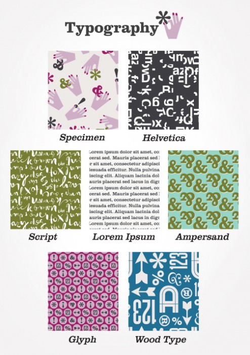
Specimen
In the land of typography, “specimens” are examples of typefaces in use. Specimens show text set in paragraphs and headlines to give a feel for the overall texture of a typeface and what the various characters look like. Here are lovely pages from some specimen books. I thought it would be funny to take “specimen” more literally and show hands daintily holding up individual characters as if to inspect them.
Helvetica
The classic Swiss typeface designed in 1957. This fabric is made with Helvetica, cut into pieces. Bet you can’t guess what phrase I chopped up.
Script
Script typefaces are based on the connected lines in handwriting. This print says, “The quick brown fox jumps over the lazy dog.” If you weren’t forced to type that sentence in typing class, you might not know it’s the classic pangram that uses every letter of the alphabet. It’s been around for a long time. My Helvetica print is also made from this phrase, though you’d never know it.
Lorem Ipsum
It’s the placeholder text that designers use in ads and brochures before we get actual copy from the client. Lorem Ipsum has been in use since the 16th century. It looks like Latin, but it’s nonsense. You can generate paragraphs of it in design software programs or on this website. This is inside-joke fabric. Designers snicker every time something appears in public that still has dummy text in it. Whoops, somebody forgot to switch out the copy.
Ampersand
I hope you know that those squiggly characters are called ampersands. If you didn’t, now you do.
Glyph
Any single character—an individual letter, number, punctuation mark, or dingbat. For example, an “A” and an asterisk are both glyphs. In this fabric, “123” is not a glyph. It’s three glyphs, but that’s okay. Mostly I just like the word “glyph” and it reminds me of a movie scene that made me laugh really hard.
Wood Type
Once upon a time, before modern printing methods, letters were carved out of wood, arranged to form words, inked, and sheets of paper were pressed onto them. Prints often looked a little irregular or distressed. The characters in my fabric print are not distressed in the least, so Wood Type is sort of a misleading name. However, fabric designers have to name their prints something, and this print reminded me of that era when it was popular to use a crazy mix of different typefaces all at once. A time to which we’ve returned!